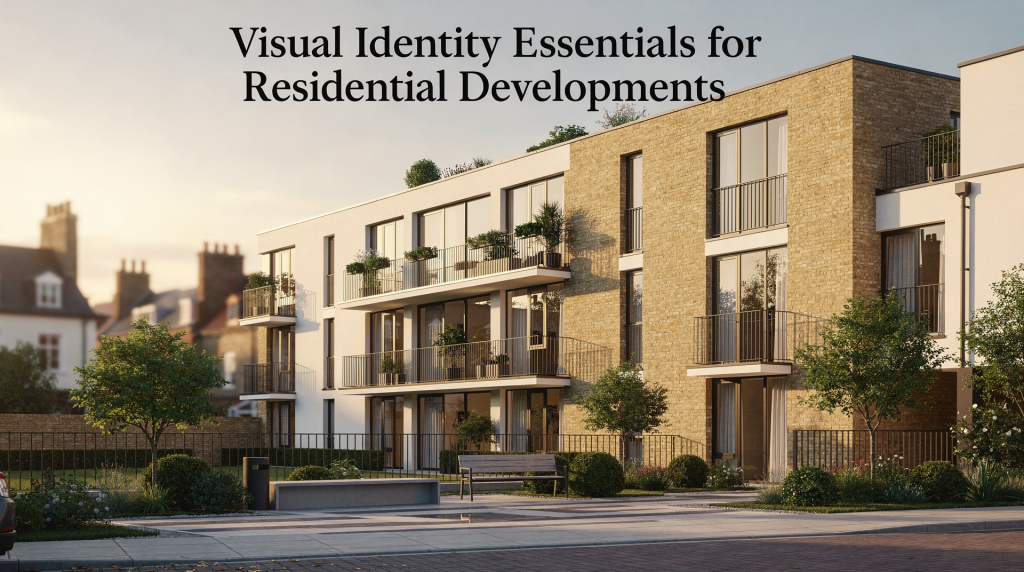
When a buyer scrolls through property listings or walks past a sales gallery, they make a series of micro-judgments in seconds. They are not just evaluating floor plans or square metres — they are reading the visual signals the project sends out. A residential development’s visual identity is not a logo sitting on a brochure cover. It is the complete system that determines whether a project feels coherent, credible, and worth the price tag long before anyone sets foot inside a show apartment.
For developers launching off-plan schemes, this system does the heavy lifting. It shapes recognition across digital ads, site hoardings, sales suites, email sequences, and reservation documents. When the building does not yet exist, the identity has to carry the weight of the promise. Buyers need to trust what they cannot yet touch, and a fragmented or generic visual language makes that trust impossible to build.
I have spent years working on brand identity systems — first in consumer goods across EMEA, then increasingly in residential and mixed-use projects. The mechanics are similar, but the stakes are different. A shampoo rebrand rarely affects someone’s life savings. A property purchase does. That is why the visual identity of a development is not decoration. It is a commercial tool that either supports the sales process or quietly undermines it.
What visual identity means in residential development
At its core, visual identity is the visual language a project speaks. It includes the logo or wordmark, the colour palette, the typographic system, the image treatment, the graphic devices, the layout principles, and the rules that govern how all of these elements appear across marketing and sales materials. When these components work together, the project feels intentional. When they do not, it feels assembled.
For a residential scheme, the identity has to do more than signal “premium” or “contemporary.” Those words have become so overused they now mean almost nothing. The identity needs to reflect the actual positioning of the project — its price point, its architectural character, its location, and the emotional needs of the buyer group it is designed for. A family-focused suburban development should not look like a boutique city-centre tower, and a waterfront rental scheme should not borrow the visual cues of a heritage conversion. The difference matters because buyers recognise authenticity, even if they cannot articulate why.
Why it is different from generic branding
Residential visual identity operates under constraints that consumer branding rarely faces. The product does not exist at the point of sale. Buyers are making the biggest financial decision of their lives based on renders, plans, and a story. The identity has to bridge the gap between architectural intent and emotional reassurance.
It must work before completion, when the project is essentially a set of promises supported by CGIs and floor plans. It must translate architectural thinking into a marketable narrative that buyers can process in seconds. And it must remain consistent across radically different formats — a six-metre site hoarding, a mobile social ad, a printed brochure, a sales suite interior, and the automated email a prospect receives after registering interest. If the identity breaks at any of these touchpoints, the project loses coherence, and coherence is what buyers pay for.
A good residential identity is not a cosmetic layer applied after the architecture is finalised. It is a decision-making tool that helps buyers navigate complexity and arrive at a confident purchase decision.
Why visual identity matters for residential projects
A strong identity performs three functions that directly affect commercial outcomes: it creates recognition, it builds trust, and it makes the development easier to sell. These are not abstract design goals. They translate into faster lead conversion, higher enquiry quality, and more confident sales conversations.
I have seen projects where the architecture was excellent, the location was strong, and the pricing was competitive, but the visual identity was so inconsistent that prospects struggled to form a clear mental picture of the scheme. When buyers cannot picture themselves living somewhere, they hesitate. And hesitation in residential sales is expensive.
1. It helps buyers form a first impression
Most buyers encounter a development online before they ever visit the site. A paid social ad, a property portal listing, or a landing page is often the first touchpoint. If the visual identity is unclear, inconsistent, or indistinguishable from every other scheme in the same price bracket, the project becomes background noise. Buyers scroll past without registering anything memorable.
The first impression is not about wowing someone with design tricks. It is about signalling, instantly and honestly, what kind of place this is and who it is for. That signal needs to be consistent enough that when the buyer sees the project again — on a hoarding, in a brochure, or at an event — they recognise it immediately and feel the same emotional response.
2. It supports perceived value
Perceived value is shaped by visual details that most people never consciously notice. Typography that feels considered rather than default. Spacing that gives content room to breathe. Colour choices that feel appropriate to the architecture and the location. Image treatments that feel consistent in mood and quality. These details accumulate into a judgment about whether the development is worth its asking price.
I have worked on projects where a single inconsistent render — one image that looked warm and lifestyle-led, another that looked cold and technical — was enough to make a prospect question the quality of the entire scheme. Buyers may not be designers, but they are highly sensitive to visual dissonance. When the identity feels coherent, the project feels more valuable. That is not a theory; it is observable in how prospects behave during sales conversations.
3. It makes marketing more efficient
Once the identity system is properly defined, every marketing asset becomes faster and cheaper to produce. The brochure, the digital ads, the website, the hoarding, the floor plan sheets, the sales deck — all follow the same rules instead of being designed from scratch each time by different suppliers who interpret the brief differently.
This efficiency is not just about saving time. It is about protecting the project from fragmentation. Without a clear system, every new asset becomes a negotiation. One agency pushes the colour palette in one direction, another supplier chooses a different font because it is “close enough,” and within six months the project looks like it has multiple personalities. Buyers feel that inconsistency, even if they cannot name it, and it erodes confidence.
The core elements of a residential visual identity
Below is a practical breakdown of what a development identity system should include, along with the mistakes I see repeated across markets.
| Element | What it does | Common mistake |
|---|---|---|
| Name | Creates recall and positions the project | Choosing a name that sounds generic or disconnected from the location |
| Logo or wordmark | Provides the main recognisable mark | Overcomplicating the mark or making it hard to use at small sizes |
| Colour palette | Sets tone and emotional cues | Using too many colours or defaulting to “luxury beige” without strategy |
| Typography | Shapes readability and personality | Picking fonts that look stylish but fail in digital or print use |
| Imagery style | Shows the lifestyle and quality level | Mixing different photo treatments and render styles |
| Graphic devices | Adds consistency across materials | Using decorative elements that do not relate to the concept |
| Layout system | Keeps materials clear and structured | Designing each asset differently with no grid discipline |
| Tone of voice | Connects the visuals to the narrative | Writing copy that does not match the look and feel |
Each of these elements carries weight. The name is often the first thing a buyer hears, and if it feels interchangeable with a dozen other schemes, the project starts from a position of weakness. The colour palette is not about personal preference — it is about what the market expects at a given price point and what the architecture genuinely suggests. Typography that looks elegant in a printed brochure but becomes illegible on a mobile landing page is a liability, not an asset. And tone of voice is the thread that connects the visual system to the sales narrative; when the copy feels disconnected from the design, buyers sense the gap and trust erodes.
How to build a visual identity that works in practice
Building an identity that survives real-world use requires discipline. The process should start with strategy, move through architectural interpretation, and end with rigorous testing across every touchpoint. Skip any of these steps, and the identity will look polished in isolation but fail under pressure.
1. Start with the positioning, not the palette
The most common mistake I encounter is teams jumping straight to moodboards and colour swatches before they have answered the fundamental strategic questions. Identity should follow positioning, not lead it. When the strategy is vague, the visuals become a guessing game, and the result is usually something that looks attractive but says nothing specific.
Before any design work begins, the team needs to answer these questions with precision:
- Who is the target buyer — not just demographics, but psychographics, life stage, and emotional drivers?
- What is the project’s price position relative to the local market?
- Is the scheme urban, suburban, waterfront, family-led, or premium rental?
- What genuinely differentiates it from competing schemes?
- What should people feel when they encounter the project for the first time?
If the answers are vague, the identity will be vague. I have seen projects where the brief said “aspirational professionals” and the resulting identity could have applied to any development in any city. That is not a positioning; it is a placeholder. The more specific the strategy, the easier the design decisions become.
2. Translate the architecture into visual rules
A residential identity should feel like it belongs to the place it represents. National design guidance consistently emphasises identity, character, materials, scale, and how a place is experienced — not just how a building looks in isolation. The visual system needs to respond to the project’s actual architectural and locational character.
This means different schemes demand different visual approaches. A development with clean, modern architecture may suit a restrained, minimalist system with generous white space and precise typography. A nature-led scheme may need softer palettes, organic graphic shapes, and imagery that prioritises atmosphere over sharp architectural detail. A heritage-led project may call for a more tactile, editorial feel — something that suggests permanence and craftsmanship rather than trendiness.
The key is alignment. The visuals should reinforce the architectural story, not compete with it or ignore it. When the identity feels disconnected from the building, buyers sense the mismatch. When it feels like a natural extension of the architecture, the project gains credibility.
3. Design for all touchpoints at once
Residential identity often fails because it is designed for a single hero asset — usually the brochure cover — and then stretched awkwardly across everything else. In reality, the system has to function across a wide range of formats, each with its own constraints and requirements.
Plan from the start for:
- website hero sections and mobile navigation
- paid social ads in multiple aspect ratios
- printed brochures and leave-behind materials
- hoardings and site signage at large scale
- sales office interiors and wayfinding
- email templates and CRM sequences
- floor plan sheets and specification documents
- reservation packs and legal paperwork
- presentation decks for sales teams and investors
If the identity cannot survive all of these applications, it is not complete. I test early design directions by placing them into the least forgiving formats — a tiny mobile ad, a massive hoarding, a text-heavy floor plan page. If the system holds together across extremes, it is robust. If it breaks, it needs rethinking before launch.
4. Build a clear hierarchy
Buyers scan quickly. They do not read marketing materials in a linear, careful way — they jump between headlines, images, and key details, forming impressions in fragments. Every visual identity system should make that scanning process easier, not harder.
A useful hierarchy typically follows this structure:
- Development name
- Primary message or proposition
- Key visual
- Supporting details
- Action point
When this hierarchy is consistent across touchpoints, the project feels more organised and more credible. The buyer’s eye knows where to go first, second, and third, which reduces cognitive friction and speeds up comprehension. That matters especially in digital advertising, where you have fractions of a second to communicate before the user scrolls past.
Common visual identity mistakes in residential development
Many project identities fail for predictable reasons. I see the same patterns across markets and price points, and they are almost always avoidable.
- Trying to look like every premium development. The result is a generic, polished identity with no memorable point of difference. When every scheme in a city uses the same serif font, gold accents, and beige palette, none of them stand out. Buyers cannot remember which project was which, and the marketing spend is wasted on sameness.
- Over-designing the logo. If the mark becomes unreadable on a hoarding or a website header, it has failed its primary job. Complexity that looks clever in isolation often collapses at small sizes or large scales. A residential logo needs to work harder than most — it must be legible from a moving car and clear on a mobile screen.
- Using render styles inconsistently. One image looks warm and lifestyle-led, another looks clinical and overly technical. This happens when different CGI suppliers work without a shared brief, or when the identity guidelines do not specify image treatment. The result is a project that looks like two different developments, which confuses buyers and undermines trust.
- Ignoring the target audience. A young renter, a downsizer, and a family buyer respond to different visual cues. What feels sophisticated to one group may feel cold to another. What feels warm and approachable to one may feel unsophisticated to another. The identity must be calibrated to the actual buyer, not to the personal taste of the development team.
- Separating brand and sales strategy. If the identity looks elegant but does not help explain price point, specification, or lifestyle, it becomes ornamental. The visuals should support the sales conversation, not exist in a parallel universe. Sales teams need materials that help them tell the story, not materials that look beautiful but say nothing useful.
- Leaving guidelines too loose. Without clear rules for colour use, spacing, typography, and image treatment, the identity fragments quickly across suppliers. One agency stretches the logo, another introduces an unapproved colour, and within months the project has no visual coherence left. Loose guidelines are almost as damaging as no guidelines at all.
Visual identity checklist for developers
Use this as a quick internal review before launch. If the answer to any of these questions is no, the identity needs more work.
- Does the identity clearly reflect the project’s positioning?
- Does it feel appropriate for the target audience and price point?
- Can the logo or wordmark work at small and large sizes?
- Is the palette distinctive but practical for print and digital?
- Do imagery and CGI share one consistent treatment?
- Are typography choices readable across all formats?
- Can agencies and suppliers apply the system without guessing?
- Does the identity support the sales narrative, not just aesthetics?
- Will the project still look coherent six months into the campaign?
- Does the identity feel connected to place and architecture?
I recommend running this checklist with the sales team, not just the marketing team. Salespeople are the ones who have to use the materials in live conversations, and they will quickly tell you if the identity is helping or hindering their work.
A practical process for creating the identity
Over years of developing identity systems for residential projects, I have settled on a process that balances creative exploration with commercial discipline. It is not the only way to work, but it consistently produces identities that survive real-world use.
Step 1: Define the development story
Write a one-paragraph project summary that covers audience, location, offer, and emotional positioning. This paragraph becomes the foundation for every design decision that follows. If a colour choice, font selection, or image treatment does not support this story, it does not belong in the system.
The story should be specific enough that someone who has never seen the project could understand what kind of place it is and who it is for. Generic stories produce generic identities. The more precise the narrative, the more distinctive the visual system can be.
Step 2: Build a visual direction board
Collect references across categories: architecture, materials, competitor projects, photography style, editorial tone, and local context. At this stage, the goal is not decoration — it is alignment. The board should help the team agree on the emotional territory the identity will occupy before anyone starts designing.
I find it useful to include both aspirational references and local context. The aspirational references show where the project wants to sit in the market. The local context grounds the identity in reality and prevents it from feeling imported or disconnected from its surroundings.
Step 3: Develop 2–3 identity routes
Strong routes should differ in personality, not just in colour. If all the options feel like variations on the same theme, the decision is meaningless. I typically develop routes that explore different emotional territories — one might feel contemporary and minimal, another warm and residential, another premium and architectural. Each route should represent a distinct strategic choice, not just a different aesthetic preference.
This approach forces the team to have a real conversation about what the project needs to communicate, rather than defaulting to personal taste. It also gives stakeholders a meaningful basis for decision-making, which reduces the risk of subjective feedback derailing the process later.
Step 4: Stress-test applications
Before sign-off, place the identity into real use cases: a paid social ad, a brochure spread, a landing page, a site hoarding, a floor plan page, a sales deck slide. This quickly reveals whether the system is flexible enough to handle the full range of marketing and sales touchpoints.
I have seen identities that looked beautiful on a moodboard collapse completely when applied to a floor plan or a mobile ad. Testing early prevents expensive rework later and ensures the identity is built for the reality of residential marketing, not just for the presentation meeting.
Step 5: Document the rules
A development brand guide should include logo usage, colour values, typography hierarchy, image treatment, layout rules, spacing and margins, and examples of correct and incorrect use. Without this documentation, the identity will weaken as more teams and suppliers touch it.
The guide does not need to be a hundred-page document, but it does need to be clear enough that an external agency can pick it up and produce materials that look like they belong to the same project. Ambiguity in the guidelines leads to fragmentation in the market, and fragmentation costs credibility.
Visual identity and sales performance
Visual identity is often treated as a design task, but it has a direct commercial role. In residential marketing, identity helps create the perception of value that supports lead generation and sales conversations. When the identity is strong, prospects arrive at the sales suite already feeling positive about the project. When it is weak, the sales team has to work harder to overcome doubt.
The identity influences click-through rates on digital ads, trust on landing pages, brochure engagement, the quality of enquiries, how confident the sales team feels presenting the project, and how consistently the scheme is remembered after first contact. These are measurable commercial outcomes, not subjective design opinions.
That is why the identity should be evaluated not only for aesthetics, but for clarity, consistency, and sales usefulness. A beautiful identity that does not help the sales team explain the project is a missed opportunity. An identity that makes the sales conversation easier is an asset that pays for itself many times over.
When to refresh or rework a development identity
A visual identity may need revisiting if the buyer audience changes, the positioning becomes more premium or more accessible, the name no longer fits the offer, the first identity was created too early and does not match the final scheme, marketing assets look fragmented across channels, or sales teams report that prospects misunderstand the project.
A refresh should improve clarity, not simply make the scheme look new. I have seen projects where the identity was redesigned purely for novelty, and the result was confusion — existing prospects no longer recognised the scheme, and the new identity did not communicate anything more effectively than the old one. A refresh is justified when it solves a real commercial or communication problem, not when the team is bored with the current look.
Conclusion
The best visual identity for a residential development is the one that makes the project easier to understand, easier to trust, and easier to sell. It should translate architecture and positioning into a coherent system that works across every marketing and sales touchpoint, from the first digital ad a prospect sees to the reservation pack they sign.
If the identity only looks attractive, it is incomplete. If it helps the development tell a clearer story and hold that story consistently from launch to reservation, it is doing its real job. The measure of success is not whether the design wins awards — it is whether buyers feel confident enough to make the biggest purchase decision of their lives.
FAQ
What is included in a residential development visual identity?
A complete identity usually includes the name, logo or wordmark, colour palette, typography, imagery style, graphic elements, layout rules, and usage guidelines. These components work together to create a consistent visual language that buyers recognise across every touchpoint.
How is visual identity different from branding?
Branding is the broader strategic system — it includes positioning, messaging, values, and the emotional territory the project occupies. Visual identity is the visible part of that system, covering how the project looks across channels and materials. The identity should express the brand strategy, not replace it.
Why does visual identity matter for off-plan developments?
Because buyers often decide before the building is finished. The identity helps make the project feel credible, desirable, and understandable at the earliest stage, when there is nothing physical to experience. It carries the weight of the promise and builds the trust needed for a purchase decision.
Should every residential project have a custom identity?
Not every scheme needs a highly elaborate system, but every project benefits from a clear, consistent visual framework that matches its audience and positioning. Even a small development with a modest budget will perform better in the market if its materials feel intentional and coherent rather than assembled from templates.
What is the most common mistake developers make?
The most common mistake is designing visuals before defining the strategic story. That usually leads to attractive assets that do not support sales or differentiation. When the strategy is unclear, the identity becomes a matter of personal taste, and the result is almost always generic.